






How to Read a Folder Die-Line Before You Design
A folder template looks like a strange flat shape until you know what each line does. Once you can read it, laying out the cover takes half the time.
When you order a folder, the first file you get back is usually a die-line: a flat drawing of the whole folder, unfolded, with lines in different colors. Designers who lay out brochures every week still get caught by it, because a folder has panels that face different ways, flaps that fold up, and glue areas that will never be seen.
This article explains how to read that drawing. For the short list of file rules, such as bleed size, image resolution and accepted file types, keep our artwork checklist open alongside it.
What a Die-Line Actually Shows
A die-line is the outline of the steel cutting die that will punch your folder out of a printed sheet. It is drawn at full size, so a 9 x 12 two-panel folder appears as a shape roughly 18 inches wide with pocket flaps hanging off the bottom edge.
Most templates use the same small set of line types. The exact colors vary from printer to printer, so always check the legend in the corner of the file.
| Line | What happens there | What to do with art |
|---|---|---|
| Cut line | The die cuts the sheet | Extend background art past it into the bleed |
| Fold or score line | The board is creased and folded | Keep text and logos clear of it |
| Bleed line | Extra art area outside the cut | Fill it with background color or image |
| Safe line | Inner limit for key content | Keep text, logos and contact details inside |
| Glue area | Pocket flap is glued here | Leave it free of anything important |
| Slit or window | Small cuts for cards or a window | Avoid placing fine text across them |
Find the Front Cover First
The most common layout mistake is putting the cover art on the wrong panel. On a flat two-panel folder seen from the outside, the back cover usually sits on the left and the front cover on the right, with the spine fold between them. That feels backward until you picture the folder closing.
- Locate the spine fold, the line that runs top to bottom through the middle.
- Mark the front cover panel, usually labeled on the template.
- Place your logo and headline on that panel, inside the safe line.
- Use the back cover for contact details, a short list of services or a web address.
- Check the inside view of the template before you design the pockets.
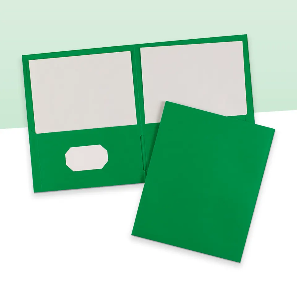
The same reading works for custom 2 pocket folders and most other two-panel builds. Gatefold and tri-fold templates add panels, but the spine-first habit still applies.
Pockets Fold up, So Their Art Turns Over
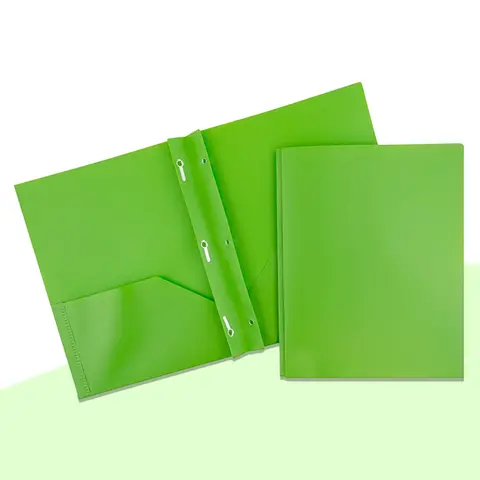
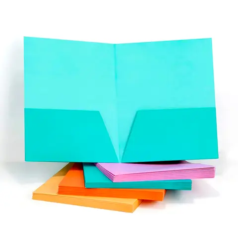
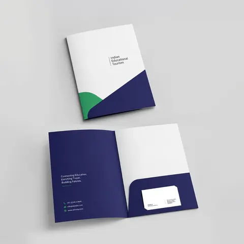
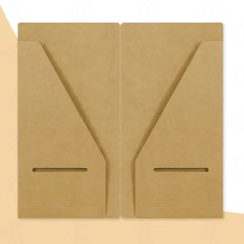
Pocket flaps are drawn below the panels on the template. When the folder is assembled, each flap folds up and is glued along its edges. On most one-piece pocket folders the visible face of the pocket prints on the same side of the sheet as the covers, and it sits upside down on the flat template. The template marks it, but it is worth checking by eye.
Glue tabs on the outer edge of each pocket are hidden once the folder is made. Anything you place there will be covered or smeared with glue, so treat them as no-art zones. Background color can run across them so no white edge shows.
- Rotate pocket art 180 degrees if the template shows it upside down.
- Keep logos and text clear of the glue tabs and the pocket fold.
- Let the background color run past the pocket edge into the bleed.
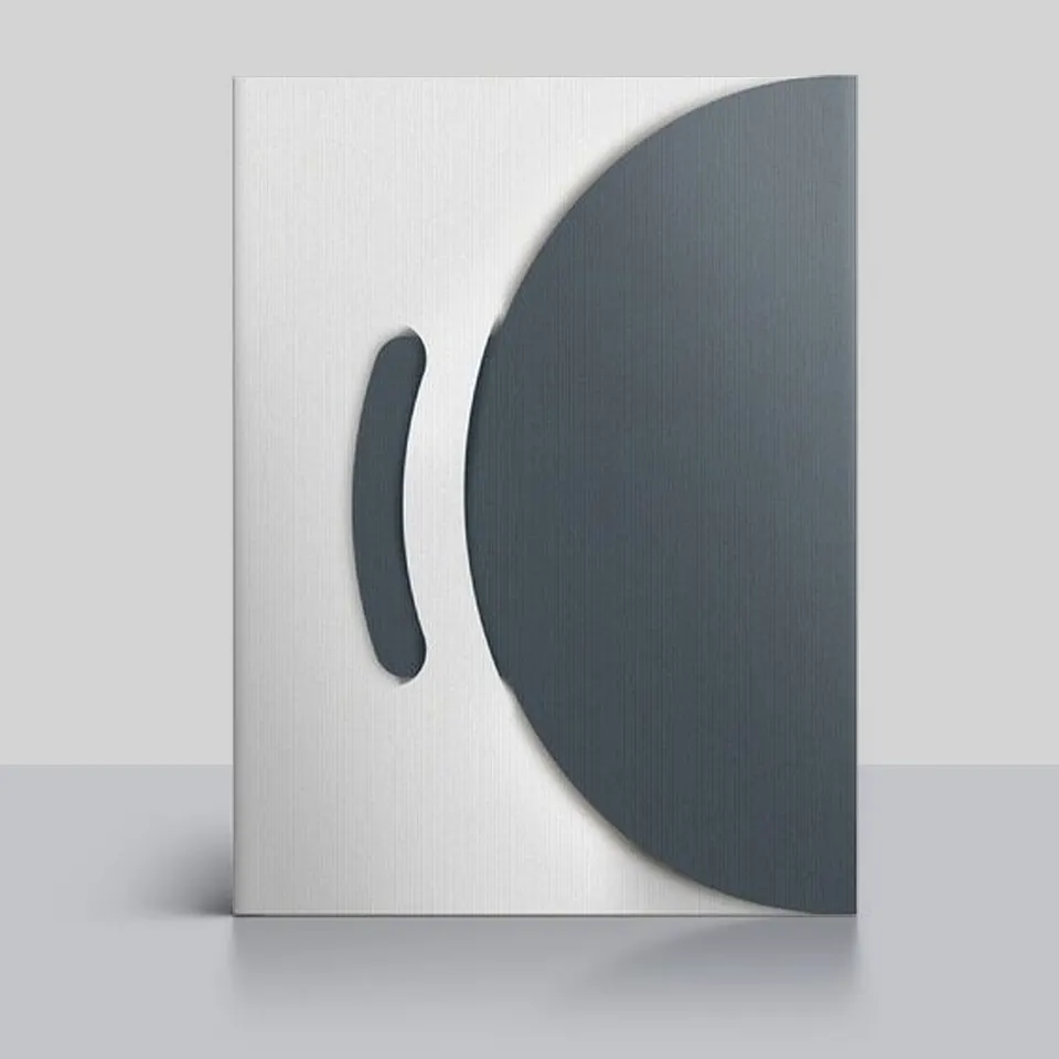
- Remember that a curved or angled pocket edge shows more of the inside panel.
Card Slits, Windows and Spines
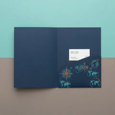
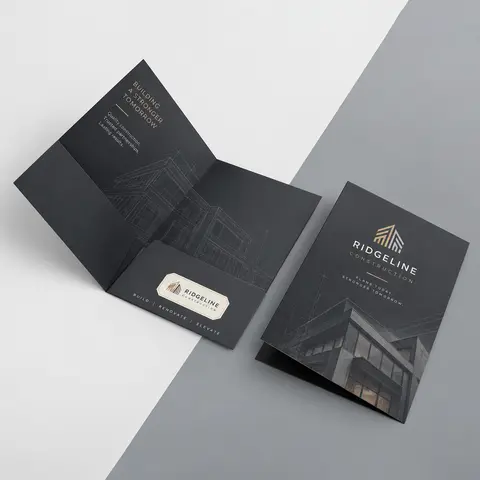
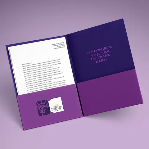
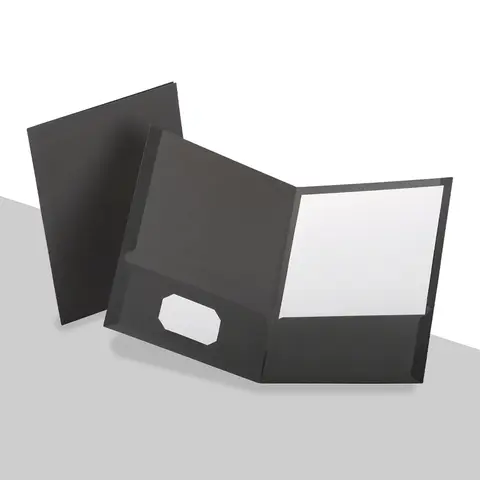
Card slits are short diagonal cuts in a pocket that hold a business card by its corners. They look tiny on the template, but a slit cut through a line of small text leaves it hard to read. Keep type away from the slit area and let a plain color or pattern run behind it. Card slits usually sit on the right pocket, because readers look right first when a folder opens.
Windows and custom shapes on custom die-cut folders work the same way: the cut removes part of your printed area, so artwork near the window must be planned around it rather than over it.
A spine or capacity build adds a narrow panel between the covers. Text on a spine has to be short and set in the safe area of that strip. If the folder will sit upright on a shelf, put the company name and the document title there.
Using the Inside of the Sheet
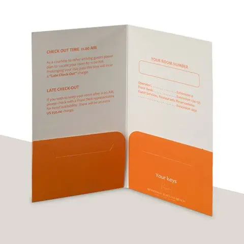
The inside of the folder prints on the other side of the same sheet, and it is often wasted. A left panel can carry a contents list or next steps. The panel above each pocket can carry a label, which is useful on onboarding and medical folders where people have to put forms back in the right place. On custom presentation folders for client meetings, the inside left panel is a natural home for a short welcome note.
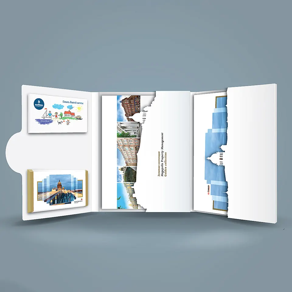
Decide early whether the inside prints at all, because it affects the price and the proof. If it does, design both sides on the same template so the inside panels line up with the right pockets.
Foil, Spot UV and Embossing on the Template
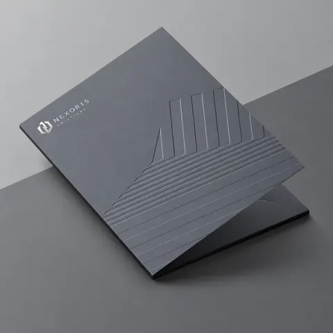
Special finishes need their own artwork, separate from the full-color art. Foil, spot UV and embossing areas are drawn as solid shapes on their own layers, lined up exactly with the printed art beneath. The template is where you check that those shapes sit inside the safe line and away from folds, since a raised or foiled logo across a fold can crack.
A blind emboss, which is raised with no ink, still needs its own layer even though nothing prints there. If you are not sure how a finish will look on your stock, our article on choosing paper stock and finish walks through the combinations that work.
Checking the Proof Against the Template
When the digital proof comes back, it shows your art placed on the die-line. Read it in this order: front cover, back cover, spine, inside panels, pockets, then slits and windows. Look for text sitting on a fold, a logo crossing a glue tab, and pocket art facing the wrong way.
If something is off, it costs far less to fix at proof than after printing. Ask for changes until the proof looks right, and follow the folder artwork guidelines and file checklist for bleed, resolution and color before you send the final file.
Questions Readers Ask
What is a die-line?
It is a full-size drawing of the unfolded folder, showing where the sheet will be cut, folded and glued.
Where is the front cover on a folder template?
Seen from the outside, the front cover is usually the right-hand panel and the back cover the left, with the spine fold between them.
Why is the pocket art upside down?
Pocket flaps fold up onto the inside panels. On most one-piece folders their visible face prints upside down on the flat sheet.
Can I put art on the glue tabs?
Background color can run across them, but anything important will be hidden or covered with glue.
How do I keep text away from card slits?
Leave the slit area plain or patterned and keep type clear of the small diagonal cuts.
Do I need a separate layer for foil or spot UV?
Yes. Each special finish goes on its own layer as a solid shape, lined up with the printed art.
Can the inside of the folder be printed?
Yes. Inside printing is common for contents lists, labels above pockets and contact details.
What should go on a folder spine?
A short company name and document title, set inside the safe area of the spine strip.
How do I get a die-line template?
Ask for one with your quote request. Each style and size has its own template, and it is free.
What should I check first on my proof?
Check that the front cover art is on the front panel, then look for text on folds and pocket art facing the right way.