


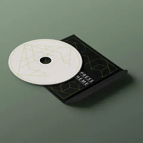
Choosing Paper Stock and Finish for a Printed Folder
The same design can feel ordinary or expensive depending on the board it is printed on and the coat on top. Here is how to choose both from how the folder will actually be used.
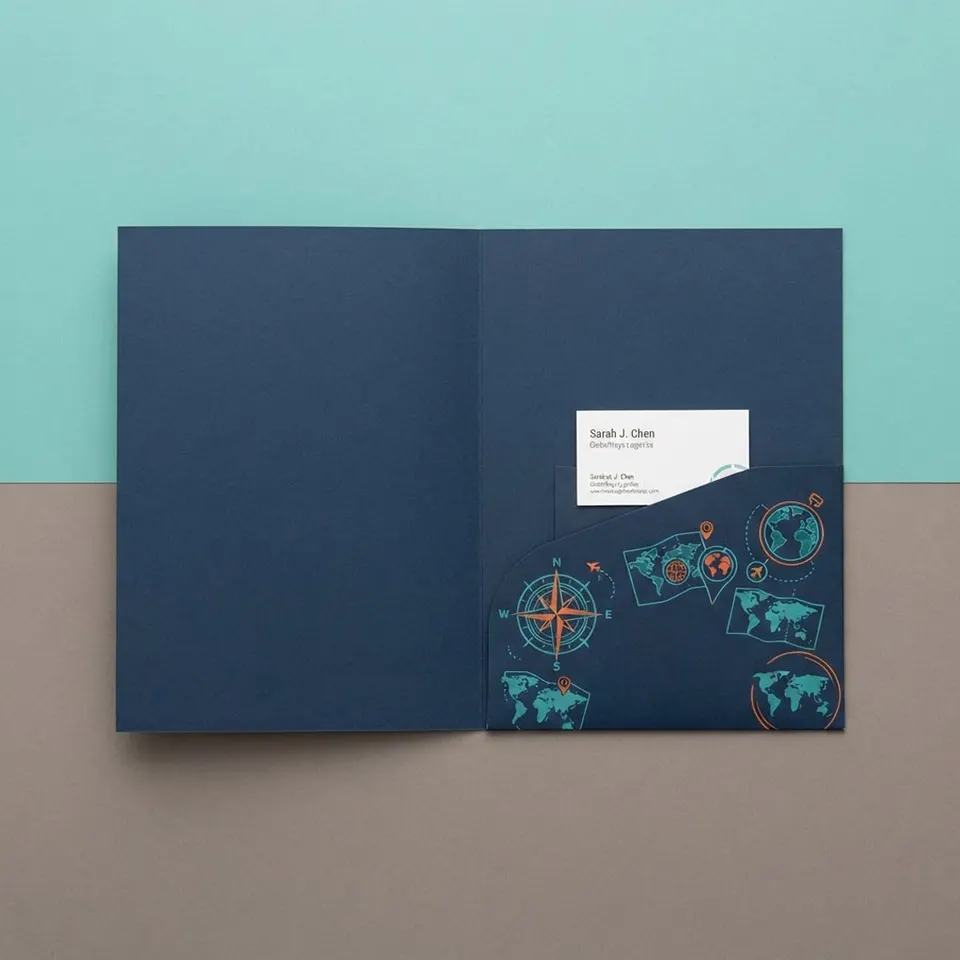
A stock list on its own does not tell you much. Knowing that 16 pt is thicker than 14 pt is useful, but it does not tell you which one your sales team should carry, or whether a linen cover will make your photos look dull. The better way to choose is to start with what happens to the folder after it leaves your hands.
Below we work through that decision in the order a printer would: load, handling, look, then the finishing touch.
Start With What the Folder Has to Carry
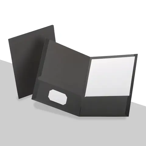
Stock thickness is measured in points, thousandths of an inch, for board, and in pounds for lighter cover paper. The heavier the set inside, the stiffer the board should be, or the folder bows and the pockets sag.
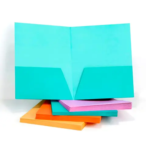
A light handout of a few sheets sits happily in 100 lb cover. A typical sales kit with a proposal, a price sheet and a brochure is what 14 pt C2S is made for. Once you pass about 20 sheets, 16 pt or a capacity pocket keeps the folder flat. Heavy sets, oversized folders and anything meant to feel weighty belong on 18 pt board.
| What goes inside | Stock to start from | Why |
|---|---|---|
| A few loose sheets | 100 lb cover | Light, smooth and prints sharp color |
| A standard sales kit | 14 pt C2S | Stiff enough for most pocket folders |
| More than about 20 sheets | 16 pt C2S | Holds its shape under weight |
| Oversized or premium sets | 18 pt board | Firm in the hand, does not flex |
| Daily use in bags or trucks | Poly | Bends, resists water and wipes clean |
Think About Who Handles It, and How Often
A folder passed across a desk once has an easy life. A folder that rides in a tote bag for a conference day, lives in a patient's car, or travels in a contractor's truck takes real wear. Corners scuff, dark covers show fingerprints, and paper softens if it gets damp.
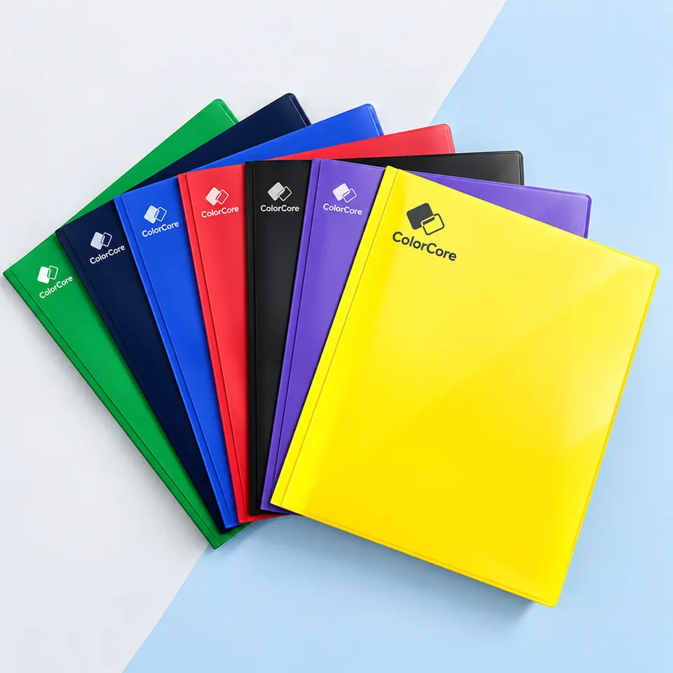
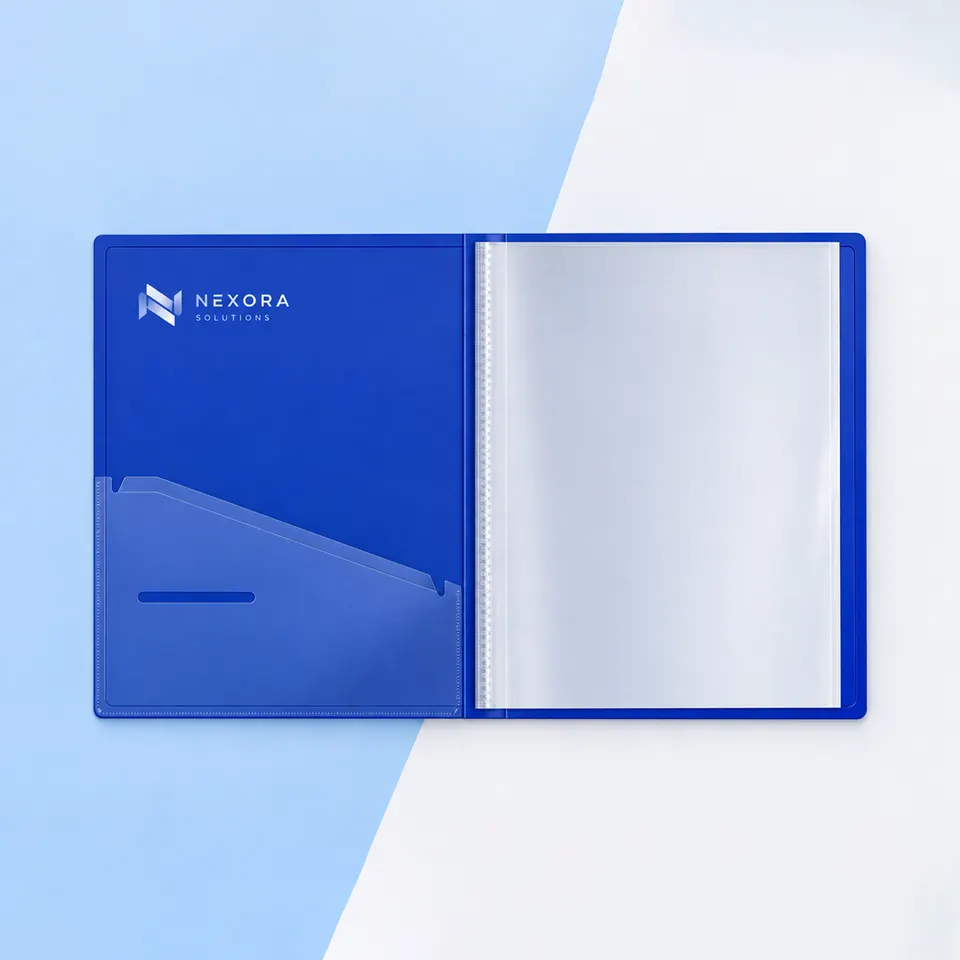
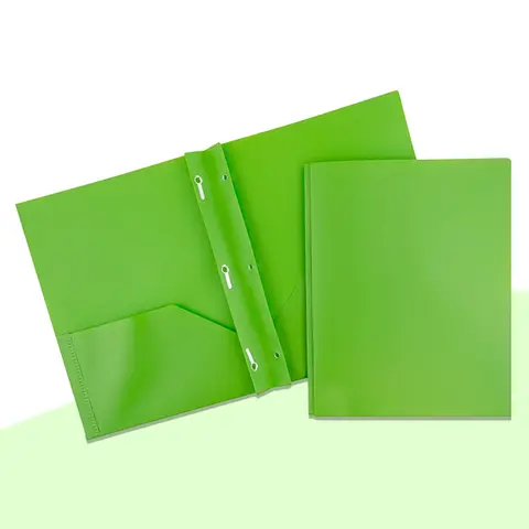
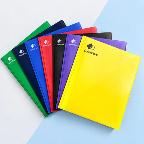
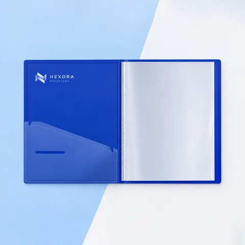
For that kind of life, lamination or poly is the safer bet. Polypropylene folders bend without creasing and wipe clean, and custom plastic folders for daily use come in clear, frosted or solid colors. On paper folders, a gloss or matte laminate protects the print where a plain aqueous coat would wear through.
- Handed over once at a meeting: any coated board with aqueous coating.
- Carried around for a day: lamination on 14 or 16 pt.
- Used for months: poly, or 16 pt with lamination on both sides.
- Written on by the client: an uncoated stock, so pens do not smear.
Texture Changes How Ink Looks
Coated board, labeled C2S for coated two sides, gives the sharpest color and the cleanest photos. Textured and natural stocks trade some of that sharpness for character, and it pays to know what you are giving up.
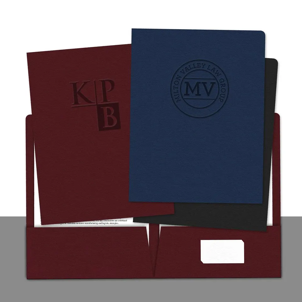
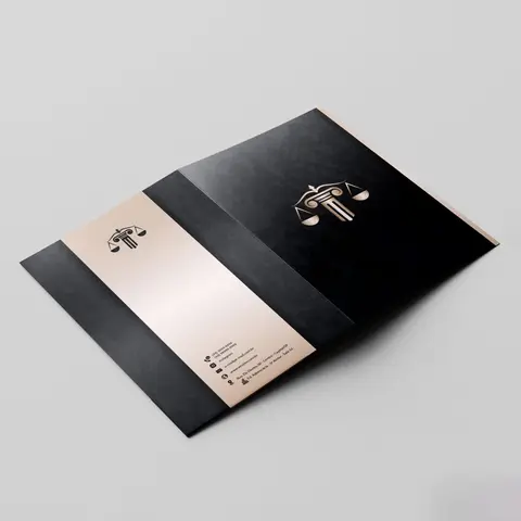
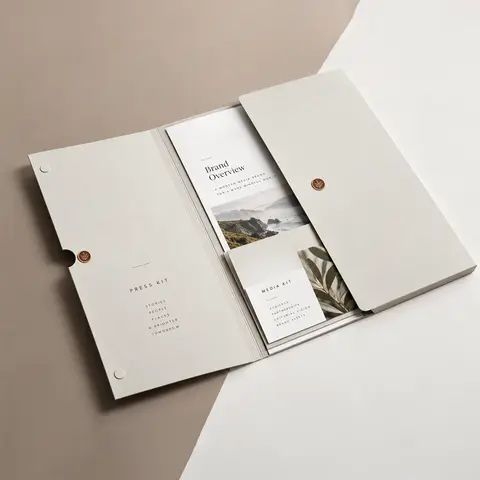
Linen cover has a fine woven crosshatch. It suits one or two solid Pantone colors and foil, and full color is possible, but the weave shows through photographs. That is why law firms and certificate folders favor it and real estate photo covers usually do not.
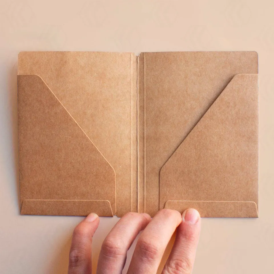
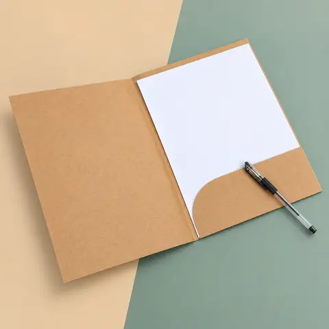
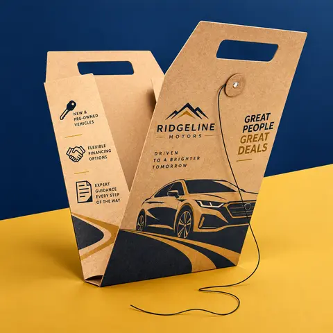
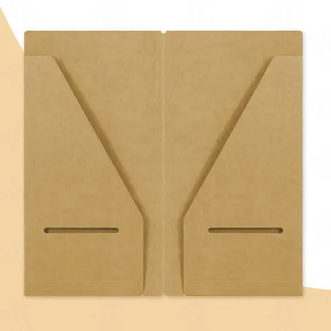
Kraft board is brown, so inks print darker than they would on white. Designs that work best are white ink, black, or one or two spot colors, often in a stamp-like style. Full color is possible over a white ink base. Uncoated cover has a natural, writable surface but softer color.
Coatings: Protection and Feel
A coating sits on top of the print. It changes both how the folder wears and how it feels when someone picks it up.
- Aqueous coating is a light protective layer that keeps the natural feel of the board.
- Gloss lamination adds a shiny film, deepens color and resists scuffs.
- Matte lamination is smooth and low in glare, which helps text-heavy covers read well.
- Soft-touch lamination has a velvet feel and gives a premium impression the moment the folder is held.
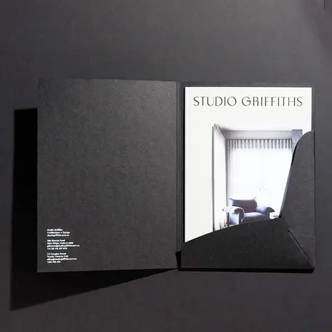
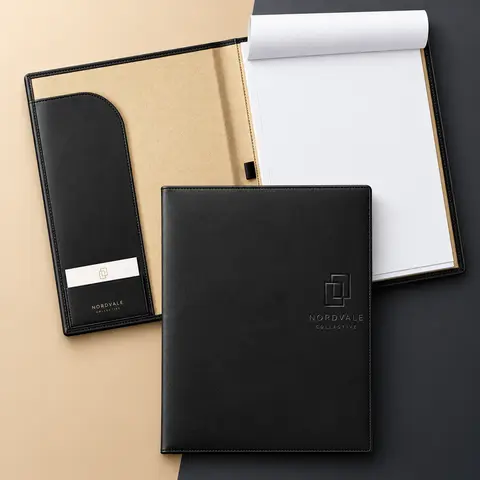
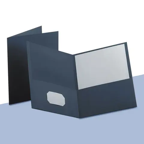
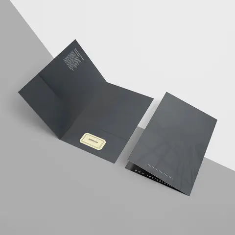
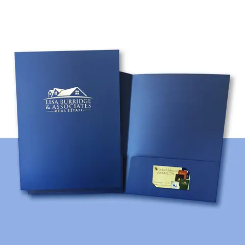
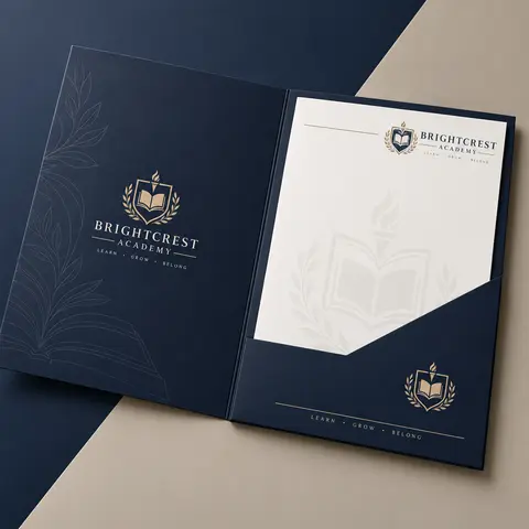
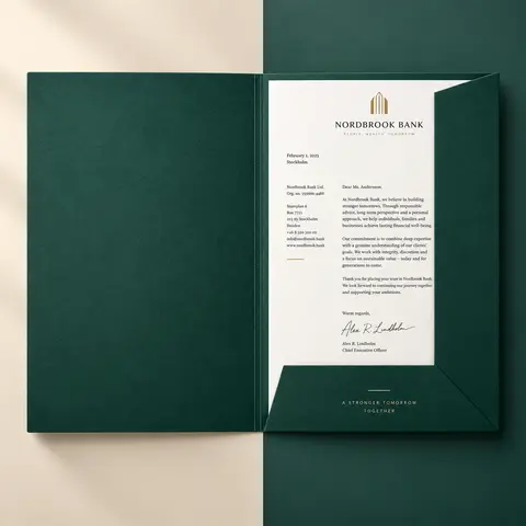
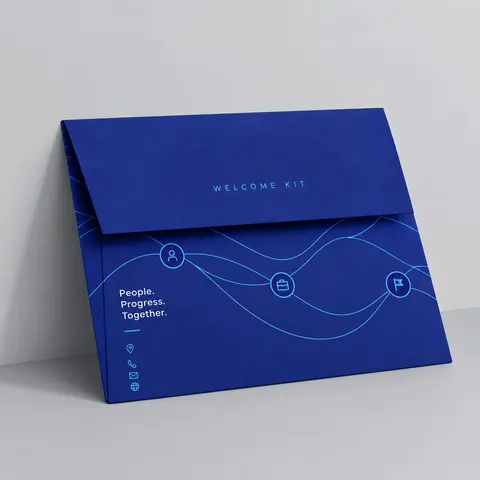
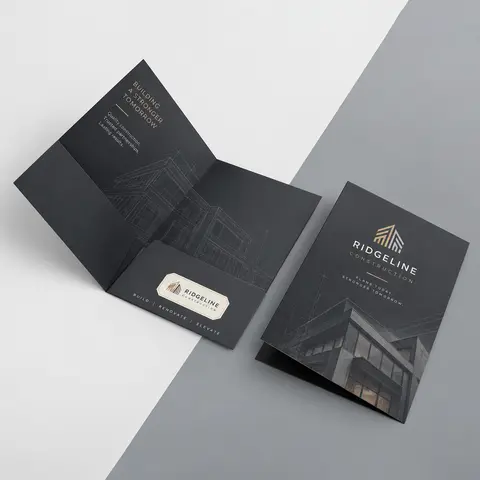
Dark covers are where coating matters most. A black or navy folder without lamination shows every scuff and fingerprint. Soft-touch is a common choice there, and custom soft-touch folders often pair it with a glossy spot UV logo so the mark catches the light against the velvet surface.
One Feature Finish Is Usually Enough
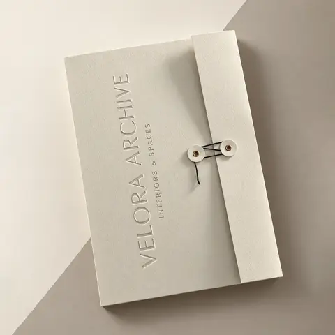
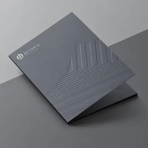
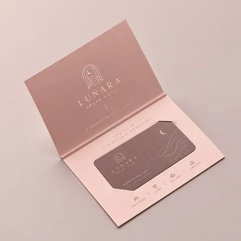
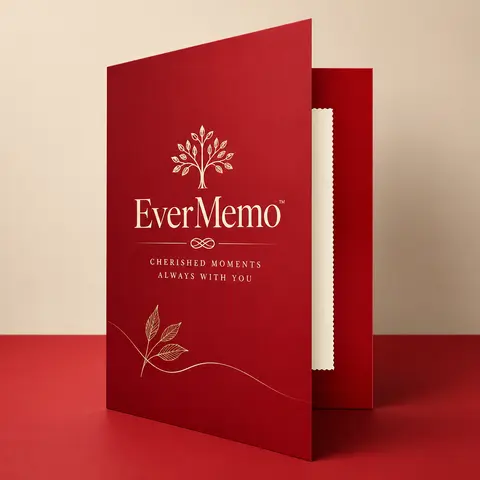
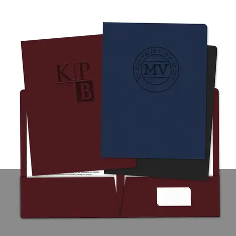
Foil stamping, spot UV and embossing are the finishes people remember. Foil adds metallic gold, silver, colors or holographic shine. Spot UV puts a clear gloss on chosen areas, usually the logo. Embossing raises the mark and debossing presses it in.
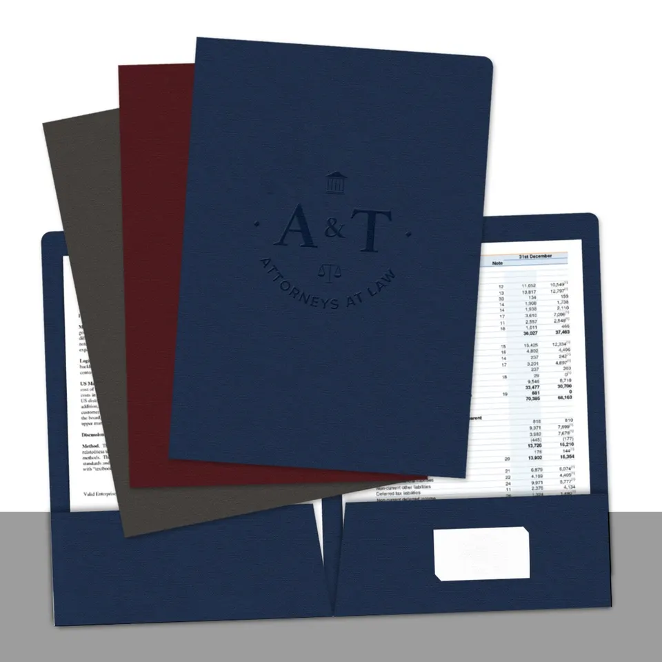
The temptation is to stack all of them. In practice, one feature finish on the logo looks deliberate and keeps attention where you want it. Two can work together when they reinforce each other, such as foil and emboss on the same mark, which is a classic on custom embossed folders.
Do Not Forget the Inside Panels
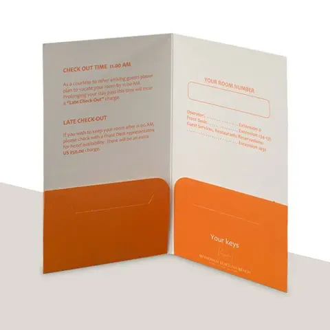
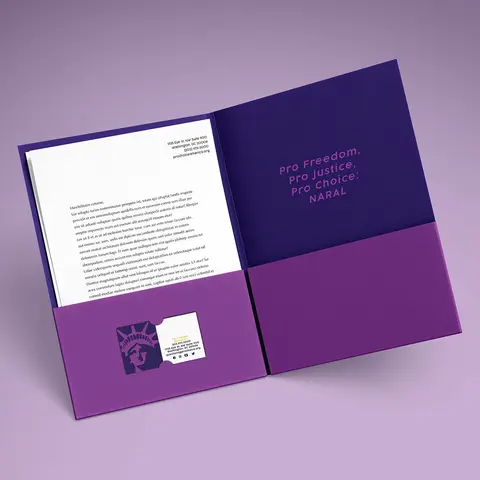
Most of the attention goes to the cover, but the inside of the folder is handled more. Pages slide in and out of the pockets, hands rest on the open panels, and clients sometimes write notes beside the documents. The coating decision should cover both sides.
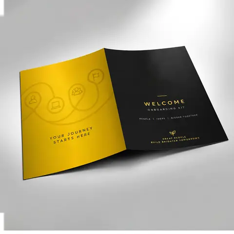
Lamination can go on the outside only or on both sides. Outside-only keeps the cost down and leaves the inside with a natural surface that takes a pen. Lamination on both sides suits folders that are opened and closed all day, such as medical and onboarding folders, because the pockets and inner panels stop scuffing.
- Leave the inside uncoated if clients or staff will write on it.
- Laminate both sides when the folder is reused many times.
- Keep inside printing simple on textured stocks so small text stays readable.
- Match the inside color to the cover so the folder looks finished when open.
Combinations That Rarely Disappoint
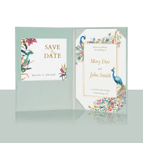
- Full color on 14 pt C2S with gloss lamination for photo-heavy real estate and event covers.
- 16 pt C2S, soft-touch and a spot UV logo for proposals that should feel expensive.
- Linen cover with one Pantone color and gold foil for law, finance and certificates.
- Kraft board with white ink and one spot color for brands with a natural look.
- Poly with a white ink base under full color for school and field folders.
If you are still deciding, the guide to paper stocks and finishes lists every stock and coating we print with a one-line description of each, and the quote form accepts "help me choose" if you would rather we suggest a build.
Questions Readers Ask
What is the difference between 14 pt and 16 pt?
Points measure thickness in thousandths of an inch. 16 pt is thicker and stiffer, so it suits heavier sets.
What does C2S mean?
Coated two sides. The board has a smooth coating on both faces, which gives sharp color inside and out.
Which stock is best for a folder people write on?
An uncoated stock. It takes pen and pencil without smearing.
Can I print full color on kraft board?
Yes, over a white ink base. Without it, colors print darker on the brown surface.
Does linen cover work for photos?
It can print full color, but the woven texture shows through photos. It suits solid colors and foil better.
Which coating hides scuffs best?
Lamination protects better than aqueous coating. Soft-touch and matte laminates are common on dark covers.
Should I add foil and spot UV together?
Usually one feature finish is enough. Foil and emboss on the same logo is a pairing that works well.
When should I choose a poly folder?
When the folder will be carried every day or might get wet, such as in schools, vehicles or field work.
How many sheets need a thicker stock?
Past about 20 sheets, move to 16 pt or add a capacity pocket so the folder stays flat.
Can I see the finish before printing?
The digital proof shows where each finish sits. Tell us on the quote form if you want help choosing the stock and finish.